


The finish applied to furniture can completely change how an interior looks and feels. Decorative Sheets provide designers and property owners with a broad palette of colours, textures, patterns, and material-inspired surfaces, making them useful for residential as well as commercial furnishing.
With so many options available, however, choosing solely from a small sample can lead to disappointing results. Scale, lighting, application, cleaning requirements, and surrounding materials all need consideration.
Start With the Application
A finish that works beautifully on a wardrobe may not necessarily be the best choice for every other surface.
Before selecting a decorative sheet, establish where it will be used.
Typical applications include:
- Wardrobe shutters
- Modular kitchens
- Office furniture
- TV units
- Storage cabinets
- Wall features
- Reception furniture
- Retail fixtures
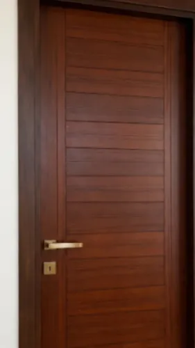
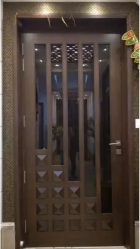
- Door surfaces where suitable
The expected level of contact and cleaning should influence selection.
Colour Looks Different at Scale
A small sample is useful for shortlisting but does not always reveal how the material will appear across a full-height wardrobe or large wall.
Dark finishes can become visually dominant when used extensively. Strong wood grains may look busier across several adjoining shutters. Very pale surfaces can respond differently under warm and cool artificial lighting.
Whenever possible, evaluate a larger sample alongside the flooring, wall colour, countertop, or adjoining furniture.
Texture Affects More Than Appearance
Texture changes both visual character and maintenance.
Deeply textured surfaces can create an interesting tactile quality, while smoother surfaces may be easier to wipe in frequently cleaned areas.
High-contact commercial environments may prioritize practicality differently from a bedroom wardrobe.
This is why a decorative finish should be selected according to use rather than appearance alone.
Avoid Too Many Competing Patterns
Modern decorative surfaces can imitate timber, stone, fabric, metal, and other materials. The variety makes experimentation tempting, but combining too many strong patterns can make an interior feel fragmented.
A more controlled palette generally works better.
For example, a New Delhi apartment might use a wood-inspired finish for warmth, a neutral solid colour for balance, and one accent material for selected furniture.
The same principle applies to offices. Reception areas can carry a stronger identity while workstation zones remain more restrained.
Consider Natural Light
Delhi homes can have very different lighting conditions depending on orientation, window size, floor level, surrounding buildings, and room layout.
A dark finish in a poorly lit room may make large furniture appear heavier. The same finish in a bright room with sufficient space can look sophisticated.
Artificial lighting also affects colour perception, so material approval under realistic lighting conditions is valuable.
Coordinate With Existing Elements
Decorative sheets should not be selected in isolation.
Look at:
- Flooring
- Wall paint
- Curtains
- Doors
- Countertops
- Upholstery
- Metal finishes
- Existing furniture
A successful interior does not require everything to match. It requires the materials to relate comfortably to one another.
Compare Quality Along With Design
Two sheets with similar patterns may differ in specification, surface characteristics, consistency, and suitability for particular applications.
When evaluating options, ask what substrate will be used, how edges will be finished, and whether the selected surface suits the intended furniture.
Madhav Tradelink works across furniture, doors, and interior furnishing projects in New Delhi, allowing decorative material choices to be considered alongside the actual furniture application.
Choosing Decorative Sheets becomes much easier when the process moves in the right order: identify the application, shortlist suitable surface types, consider maintenance, evaluate colour at scale, and coordinate the selection with the surrounding interior.
The goal is not to choose the most dramatic sample in isolation. It is to choose a finish that continues to look appropriate once it becomes part of the complete room.